Dev Log #5 - Waddling to the Finish Line
Bradley here. We did it, gamers! Well almost. Mr. President Duck is at a solid state right now after last weeks playtesting. The game ran smoothly, and the team is very proud of where it's at right now. There's just a few more tweaks, cleaning up of the itch page, and a lot of printing and cutting cards (don't worry, only I have to worry about that :') ). Anyways, I'll hand it off to Zi to discuss the next steps for MPD as we head into the final weeks of our class. Take it away, Zi!
BRADLEY exits stage left
Zi
My life for the past week can be summarized as death by moldy canned tomato, but I’m alive now. While I was dead, our awesome Agent Bradley and Agent Sam hold another wonderful playtest session of the newest version of our gameplay, and it went really well. The game is finally gaming!
Although we got some suggestions to add scene cards from the feedback, after some consideration, we decided to stick with our original plan since making additional cards is out of scope for us. As a team, we prefer letting the player set the scene. The good thing about being game designers is that we get to choose how our game turns out XD.
I don’t have much else to add here. I’m currently working on rewording the rules so we’ll have a complete game including packaging to present two weeks from now. I’m also really excited to pick up a childhood hobby and make stamps for the packaging (I hope that goes well tho).
Next, I’ll hand it over to Agent Sam to talk more about the awesome art we have!
Sam
And now, the 8 o'clock news.
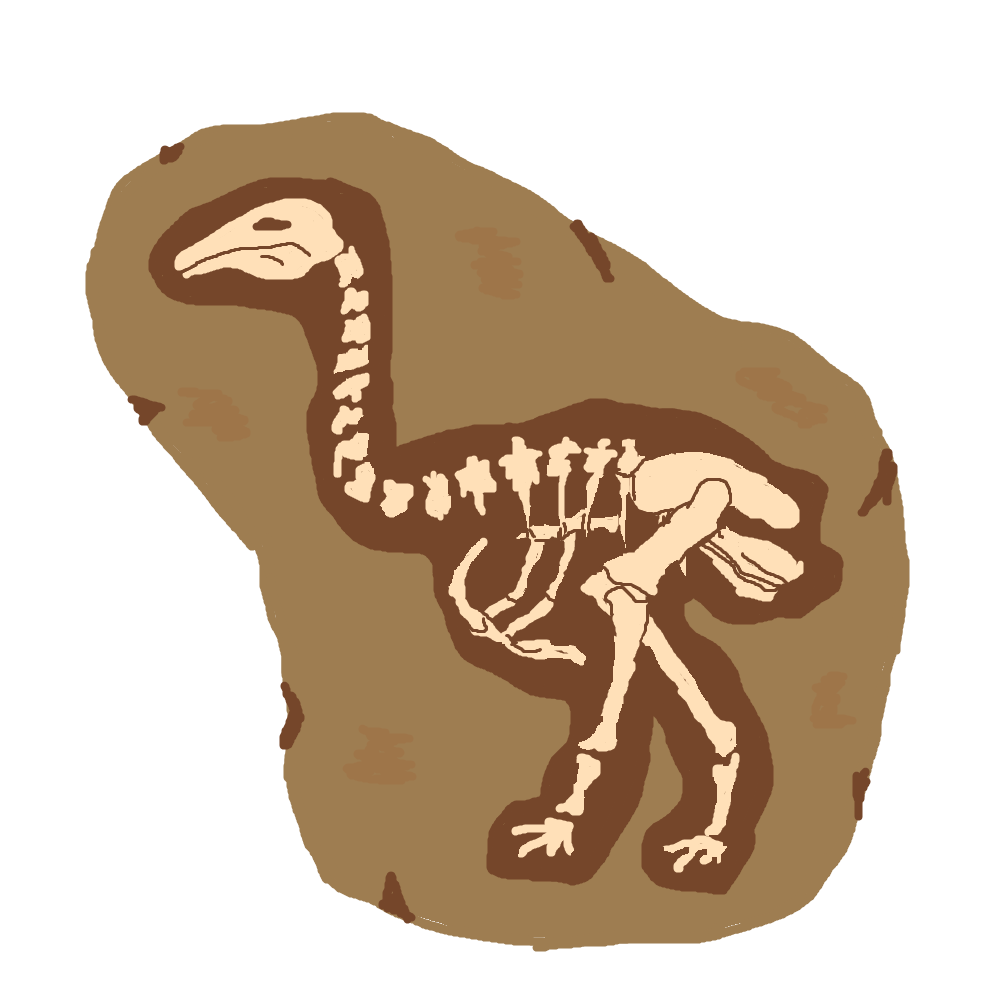
Big news from our archeology department, the remains of what our paleontologists assure us is a normal ostrich was unearthed near the capitol this week, but is it? Certain high-ranking 9, 0, 4, 6, 4 members of the government have claimed it as "A long lost ancestor" and "perhaps the missing link". We'll leave it up to our listeners to decide.
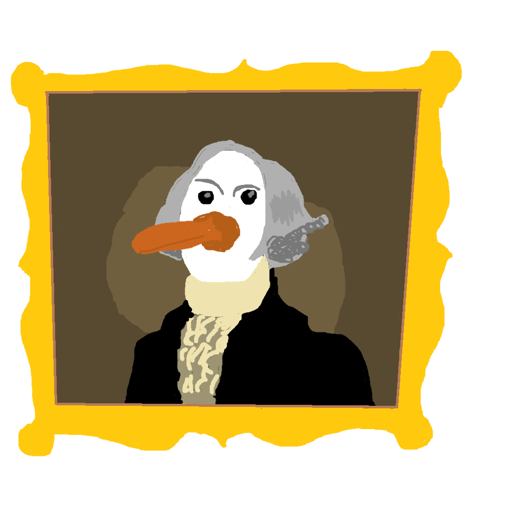
In related news, a centuries-old portrait of our first president has successfully been restored after being damaged during the recent demolition 7, 4, 2, 6, 8, 1, 0, 9 work in the Yellow House. Mr. President had no comment for our reporters on the incident, though he did say that "This country was founded on the bills of giants" and he is glad the portrait was saved.
And from our art department, we received a confused note from one of the 0, 0, 5, 4, 5 interns. The note says something about "The Sketches" and that they are "Done", and goes on to say they had "Some Help". The intern was taken away shortly afterwards for psychiatric evaluation. 8, 2, 7, 3, 1, 4. We'll keep on top of that story as it develops.
That's it for the 8 o'clock news. Stay with us as we pass you to Bradley at the Fonts Department next. Have a safe and happy evening. *indistinct* We have a Fonts Department now? Who authorized-
Bradley - Finally a Thing About Fonts
BRADLEY enters stage right
Hey gamers, I'm back. And finally, finally, I get to talk about fonts. Everyone please clap. Truth be told, I don't have that much to say about fonts, but I'll do my best anyways.
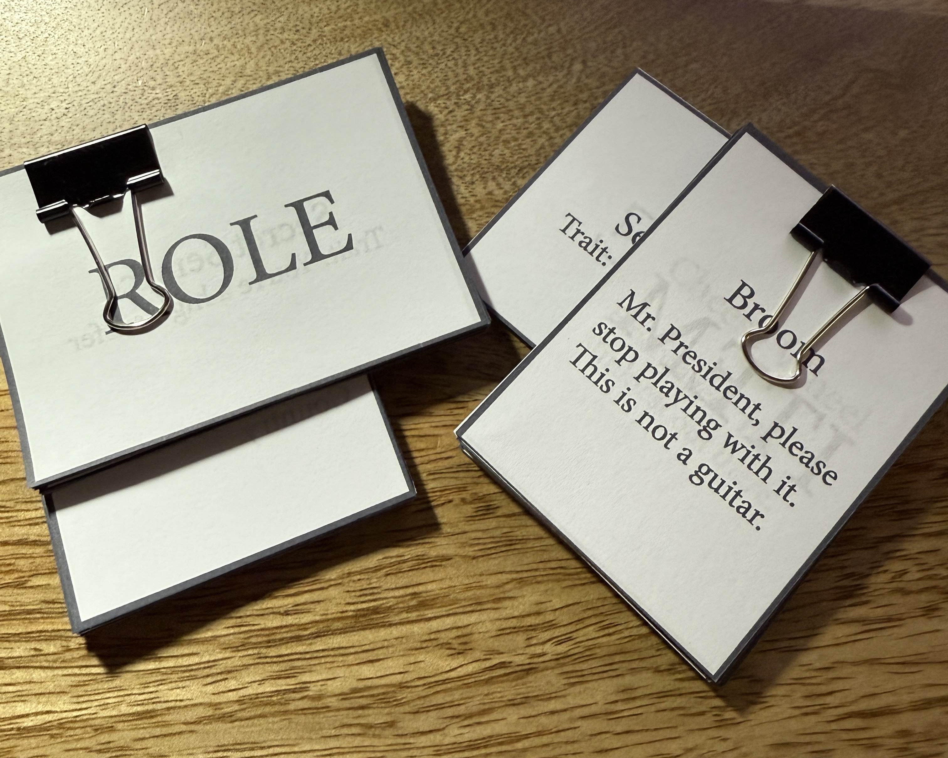
Okay, so the thing about fonts is that it's complicated and not complicated. I've always wanted to take a typography class, so maybe hopefully if I can slot something like that into my schedule I'd have more insight on the topic, but for now I'll talk about fonts in terms of my experience. So please take everything I say with a grain of salt. Or don't The main thing you want out of fonts is readability, but you also want fonts to fit the theme.
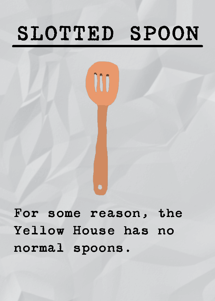
If you remember the original card designs, they weren't using the fonts they have now. For example, the role card titles used a more cursive font. While it did fit thematically, it was unreadable, which is not fun. There was a similar issue to the old fonts on item cards, but I considered the font to be readable so what's fine to some is not to others. You may see these cards up close now, but in person you're going to be reading them from a distance so that's an important thing to keep in mind when designing the cards as well. This is why we ended up switching to this "Secret Service Typewriter" font. It's both readable and thematic. And I'm usually picky about fonts so I'm glad this worked out for everyone.
With text on cards, you want your readers' attention drawn to what's most important. For the items, we mostly want to draw attention to the image of the item itself as well as the type of item. The flavor text is just where we as the designers inject our own comedy into the game and players are free to read it of course, but it has no impact on the game. This is why the name of the item is all caps while the unimportant flavor text is capitalized normally and that's how we can differentiate headings from body text with the same font. Of course, if a font has multiple styles that is an advantage but the typewriter font being used just has one style.
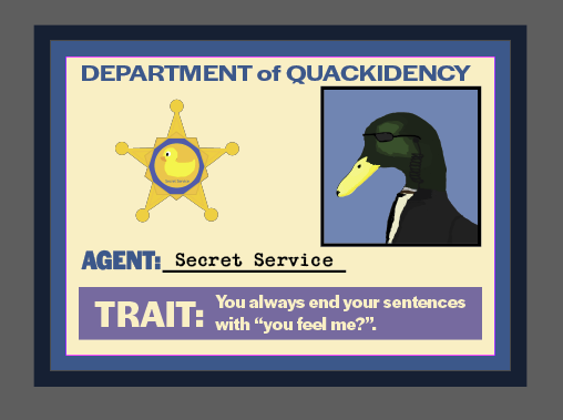
Now we look to the role cards for the game. This uses two different types of font, "Secret Service Typewriter" and "Halyard Display". When looking at the card, eyes are immediately drawn to the line that the words "Secret Service" is on. It's the only part of the card that uses the typewriter font, is underlined, and is black compared to the word "AGENT:" being blue and being a stand in as a reminder that that is the player's role.
For one, we players eyes are drawn to their role because it's the only part of the card that uses a different font, and being a different color too. We also want players to look at the "TRAIT:" section of the card. Technically they are different styles of the same font with "AGENT" being the fonts black style and "TRAIT" using a bold style, but they look pretty similar side by side. I decided to size the font up so that readers would glance down and read the trait description next to it. Part of getting readers to look at this part of the card is also backed up with the help of it being in a different colored box and font color. Now I do want to point out two other things on this card.
For one thing, the badge itself has text on it. It's a bit hard to read in that image, but it's there. Since it's integrated into the art, it's not important to look at. But, we do have the words "DEPARTMENT of QUACKIDENCY". This also uses the Halyard Display font, but in its semibold style which makes it distinct from the words "AGENT" and "TRAIT". This text is not important for the readers at all which is why that line isn't fully in uppercase and the text is has been scaled vertically as well. So readers will also end up looking at it, but because of those distinctions and looking at the rest of the card, they won't focus on it for much longer than is necessary.
My go to constraints for texts in games is that generally you should stick to using 2-3 fonts and that font sizes should not be any smaller than 10pt. Of course, there are exceptions to this such as Wingspan using small font for their fun bird facts or using a different font for the title card compared to all the other text to make it stand out more like...I actually don't have an example off the top of my head I'm sorry. Sometimes it is okay to use a cursive font for a one off thing!
In terms of what I have left to do is just transferring all the info we created on the spreadsheets and move them over to adobe files. Shoutouts to the DePaul print lab so I don't have to waste ink! I hope this was all readable to you (both in terms of font and listening to my ramblings).
Until next time, which may very well be the last time? Who knows, really?
- Bradley
Leave a comment
Log in with itch.io to leave a comment.