Dev Log #2, Part 1 - Card Design

Hi gamers!
It's Bradley here. And for this week I worked on the Role and Item card designed based on the sketches talked about in the first dev log. As a refresher, our group decided to do a photo id style for the Role cards and a crinkled paper for the Items. And I'm happy to report that I've finished the designs of them!
But you know what they say, an artists work is never done. I'm not sure who said that but it's a true fact! The designs may not be final because they could always use a few tweaks here and there but I'm proud of them as they currently stand. As we're still in the early stages of development and for the purposes of in-person playtesting (and my printer ink), we'll just stick to good old plain text on paper. And with that, I can finally start talking about card design! When making these cards I used Adobe Illustrator, InDesign, and Photoshop.
Past Experience, Game Theme and Feel
Fun fact: this is actually not my first time making card art. I worked on a board game in my undergrad called Welcome to Nowhere, a game co-op board game about players escaping a dead-end town (called Nowhere). I won't talk about the game here in detail because this isn't about that, but I thought I would start off with this because making sure the card designs fit the theme of the game is important to me.


Both for Mr. President Duck! (MPD), and Welcome to Nowhere (outside of its board), players will primarily be looking at the cards they have on hand, so of course, their designs need to be visually interesting. While I do not necessarily consider myself an artist in terms of drawing/painting and the likes, I certainly love when a game goes an extra step with their components to make them feel like they came straight out of their game world to further immerse players such as the inner part of the box in boop. being used to help form the bed board space, or the rulebook from Cat in the Box being formatted as a science experiment. It's what I attempted to do with Nowhere's Item cards and making it feel like you're peering into an old storage box and that's what I hope I achieved with the card designs for MPD.
Color Palettes
While Sam doesn't need to worry about what colors he chooses for his art, I kind of do. Having a color palette or a set of colors to use as a base for component designs is helpful for me when making these cards to keep the design the cohesive. I used Paletton to help with this process with the base color being that color of blue they use for the background of your photo ID.

I then color picked it's RGB, plugged it into Paletton, then chose the tetrad palette.

I found it amusing that with the default settings, the tetrad option had yellow, so I decided to keep the palette as is and it turns out the blues and purples would be fitting for the Role cards as well.
Role Cards
We're using standard playing card size, 63x88mm. Panda Manufacturing's website has an assortment of standard card size templates which I have used in the past. Of course, it's more helpful if these cards were being professionally produced, but it's good to always account for the bleed lines. Here's a look of a first draft of the Role card with no text. The red line represents the actual card size with rounded corners. Since I assume the final playtest/presentation might actually use these card designs, I kept the corners straight.

A few things I have to remind myself a lot is that whatever I make doesn't have to be perfect. And that goes especially for when I'm trying to replicate something to pass it off as something else like the Item card box design. In this case I was attempting the mimic the design of an FBI photo ID badge because it's usually the most recognizable type of ID layout. The ID designs are pretty simple and straightfoward. And most of there's the seal/badge and sometimes another translucent background image with other text information such as badge number.

As to not clutter the front side and ensure players focus on what role they are and what their goal is, I left most of that out. Another thing is that ID backgrounds are usually a base white, but of course I'm using the light yellow based on the palette which ends up fitting and makes it pop out more compared to just having it be white.
As for the back, again, it's plain and simple.

A lot of the references I was using had a lot of small text and was very wordy. Which is bad for a card! Because on the back of the card, you're usually supposed to have the name of the type of card it is and that's that. But I also didn't want it to be too simple. Luckily, I found a FBI ID replica reference that had a "If lost..." sentence and thought it would be okay to include just to be funny. I also threw in a QR code which links to the game's itch page to fill in the space because the back would also have an image of the seal/badge. And of course, with Richard being the professor of this class, I have opted to list him as the director of the Department of Quackidency.
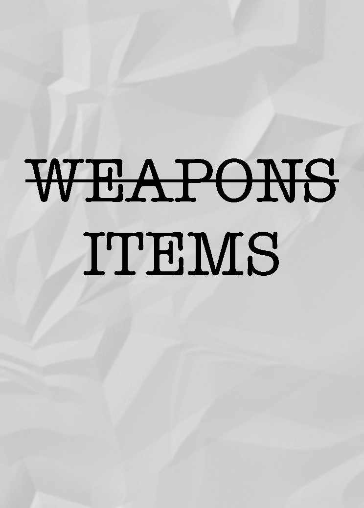
Item Cards
This one is gonna be a fun one to talk about. For the record, I am very picky when it comes to assets.
The thought process behind the card being wrinkled paper and potentially using that texture was that players are frantically grabbing pieces of paper (cards) and in the process that paper is crinkled because they're desperately trying to grab them. I searched up a few free use stock images of crumpled paper textures from Pexels and Unsplash, found one, but as it turns out, it felt off and looked too realistic for our game and its art.

It was just a bit too wrinkly for the team's taste. Luckily, I found a video that teaches you how to make the cumpled paper effect using Photoshop. The cover image for this blog post is actually the gradient pass before the embossing and gaussian blur being added.
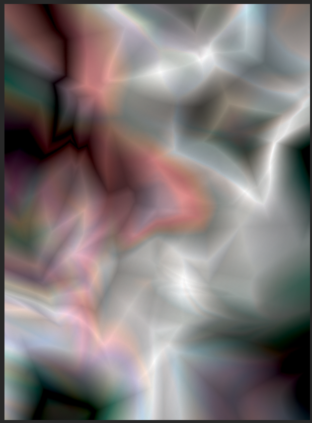
It was at these filters where I diverged a bit from the video and played around with the filter settings. I'm not sure entirely what happened between the video's version of Photoshop and the one I used, or if it's a me problem, but as you can see in the image above, there's hues of reds, blues, and greens despite following that part of the tutorial and thinking the gradient lines would be shades of black, white, and gray. Nevertheless, I was able to add a couple adjustment layers to color correct it and this was the result that we ended up using for the Item card.

I'm happy with it (for now), and if I decide that I hate, hate it, I can always quickly whip up a new version. And now is the card with the text and art.
Flavor Text
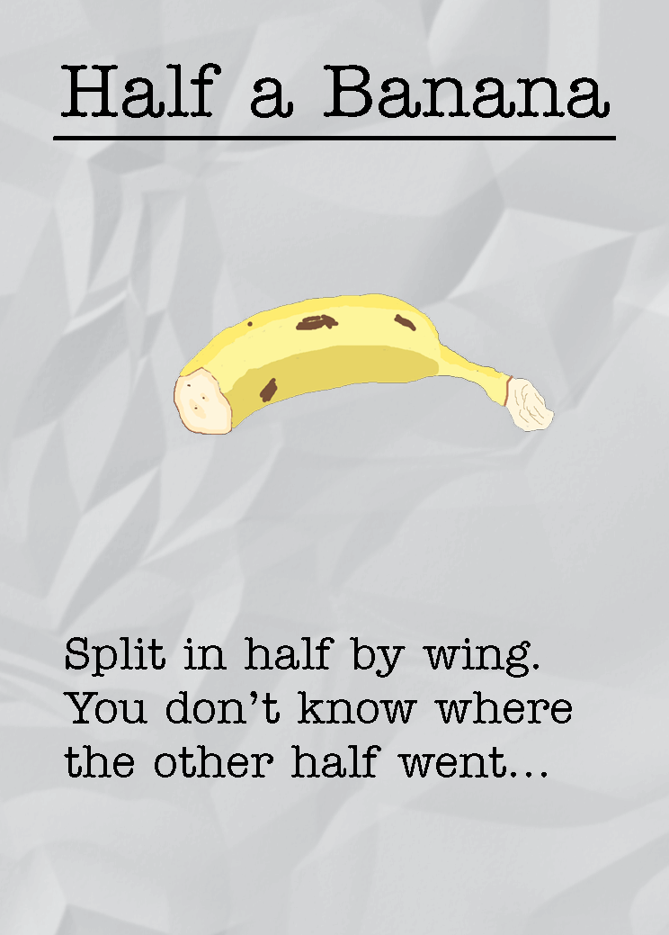
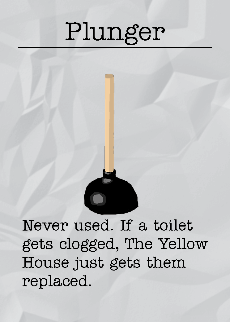
This is the part where I talk briefly about flavor text! I for one, enjoy reading flavor text in board games. It's another aspect that designers can use to breathe life into their world. Adding flavor text to any item cards is a classic go-to. Without the flavor text, the Item and Role cards, even with Sam's art, would look a bit too plain. Since this is a comedy game, it is our chance as game designers to try and be funny. Hopefully the flavor text comes across that way, haha.
A Note About Fonts
You may have noticed that I have avoided talking about fonts. They are certainly important and the cards certainly wouldn't feel alive without them. Personally, I feel like fonts are a tricky subject for me. Don't get me wrong, I love browsing the countless fonts Adobe has to offer, but at the same time it is a bit of a process because I am very picky and I know the rules of not picking too many fonts to use in one design but my current advice for fonts is to pick what feels right for your game. Yeah, I know it's not the most helpful advice, but, I can explain my process for why I ended up picking the fonts I did for the cards. But this dev log is already getting long, so I think it is best to save this topic for another time. So maybe this'll give you all something to look forward to.
Until next time! - Bread

Leave a comment
Log in with itch.io to leave a comment.